The Changing Face of Tableau: how changes to format also change game design
In this "Booklet 📖 Tableau" edition, it marks the 4th major layout variant of Tableau, each with unique constraints to result in different game designs.
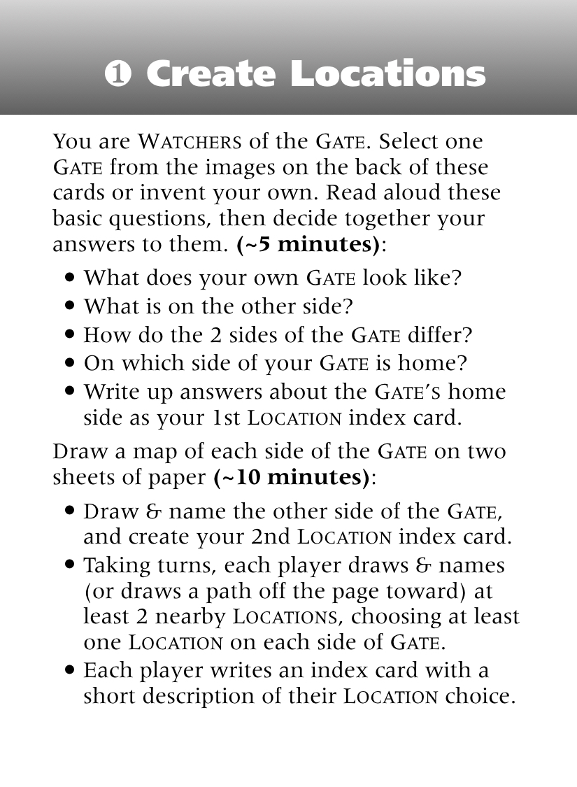
In the first version of Tableau (effectively Gate Watch 2019), every story element needed to fit on a single side of a card. For instance, this card not only serves as the Setting element for Gate Watch, it defines ALL the Settings in the game.

Given this layout, I couldn't offer enough details and nuance to inspire all the different kinds of gates possible, and I also wanted to keep the number of cards in the game minimal. So I was inspired to use the "wasted" space on the reverse side of the game's 18 cards inspirational images. This approach proved effective in both playtesting and the 2019 Kickstarter.
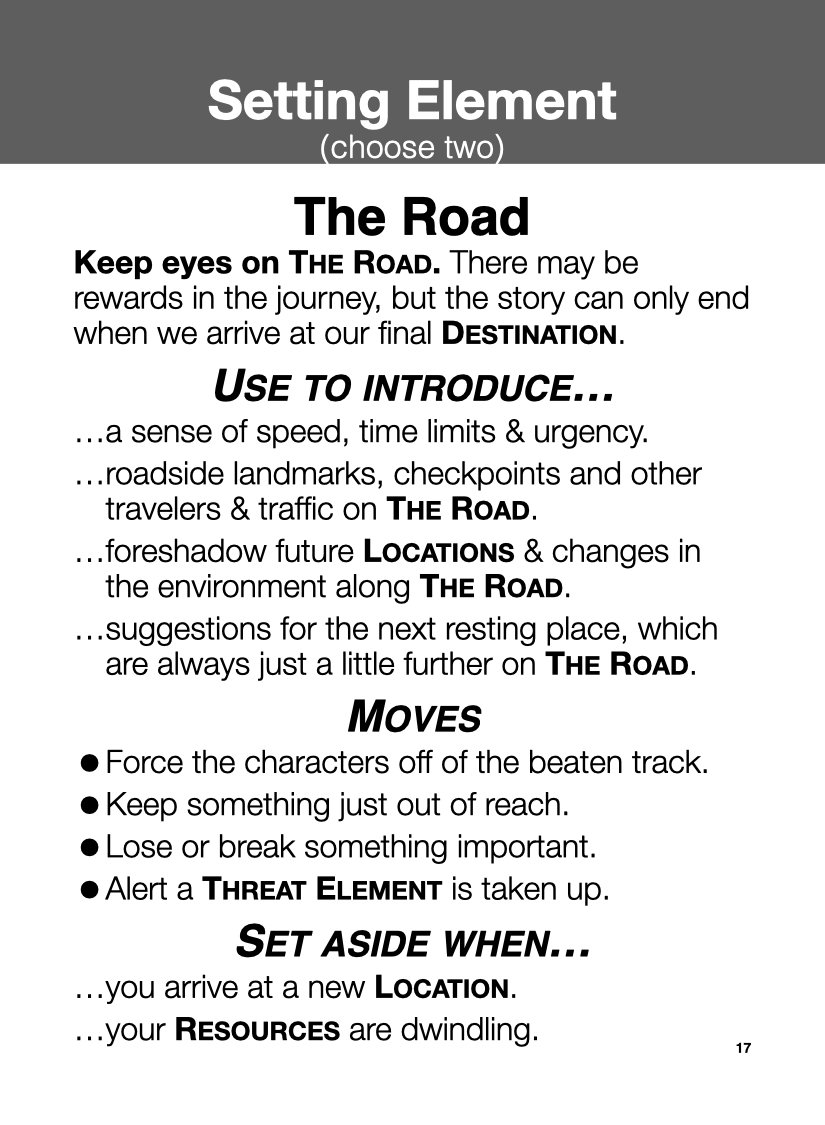
In late 2019, my plan was to create a sequel for Gate Watch, which was also expected to be an 18-card set. So I wrote up a similar Setting element based on The Gate to be The Road, and the back of all 18 cards were different roads.
I was struck with how the new The Gate card resembled the original The Road card. In conversations with Aaron Reed, we brainstormed that maybe the two games could be mixed and matched. He suggested a third-playset Generations that also might fit in 18 cards. So, we began to puzzle out the 2nd layout variant, where the specific story elements you wanted to play were placed on the table, and we created rules for when to take them up from the table or set them aside.
Aaron was much better than I at being concise — cutting to the heart of each story element. Whenever I added something new, the card text would overflow, either resulting in two cards, or Aaron trimming it back again.
However, with the onset of the pandemic, collaborating with Aaron and playtesting this version became problematic. But I continued to work on it over the first lockdown summer and found myself stuck. I tried some larger formats (tarot-sized cards), which helped, but ultimately, the text was excessive for only one side of the card.
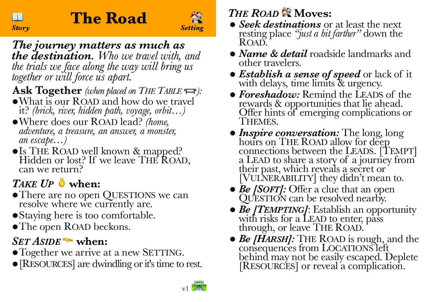
Adopting the current two-sided cards worked well for the rules — Setup text would be on one side, and the Moves on the other. Additionally, color coding and symbols aided playability when there were more cards on the table or in a storyteller's hand. I missed however having an evocative image on every card, so instead they are included as their own cards, which also makes them easier to use with other Playsets.

Following the successful Kickstarter for the revamped Gate Watch and Twilight Road, which utilized this card layout, I began work on my next major playset, Lovecraft Country: ‘A Study in Madness’ but I encountered new issues — the Print-N-Play format for cards didn't work well double-sided, and cutting out proved tedious for most of the playtesters. The latency from when I updated a set of cards at DriveThruCards, had them printed and delivered to me, and then sent them to the playtesters, was far too long. Also, this same latency was challenging for marketing the game, as you couldn't easily download and play.
I was inspired to try out this "Booklet 📖 Tableau" format after trying a number of other ideas — printed half-page, quarter page, etc. Discovering this origami-inspired format, each page was roughly the size of a card and allowed me to reuse my existing card layout with minimal changes. I also liked how easy they were to Print-N-Fold — my first was sloppy, but now I can fold one quickly.
The "Booklet 📖 Tableau" format presents a challenge: now the Tableau cards have to be printed together in sets of three, which limits the flexibility of the poker-card card version, but also offers some opportunities. I'm calling one version of these "Storysets 📖". I've also been exploring some different approaches to leverage "Booklet 📖 Tableau" format using multiple booklets, blank space for writing, and the space for 1/2 a card on the back of the booklet.
This week, I'm happy with the conversion of the Tableau Core ꩜ Rules and the first two Storysets 📖. I also believe these formats will make Tableau's approach to storygames more accessible to the 'belonging outside belonging' community on itch.io. I've also some other unique ideas I plan to try out in future playtesting.
Let me know how this format works for you!
Get Tableau Core ꩜ Rules (“name your own price” Print-N-Fold Tableau Booklet 📖)
Tableau Core ꩜ Rules (“name your own price” Print-N-Fold Tableau Booklet 📖)
Collaborative Cinematic Storytelling — A blueprint and foundation to build stories across diverse genres.
More posts
- How to Assemble a Tableau Booklet 📖Sep 15, 2023
Leave a comment
Log in with itch.io to leave a comment.